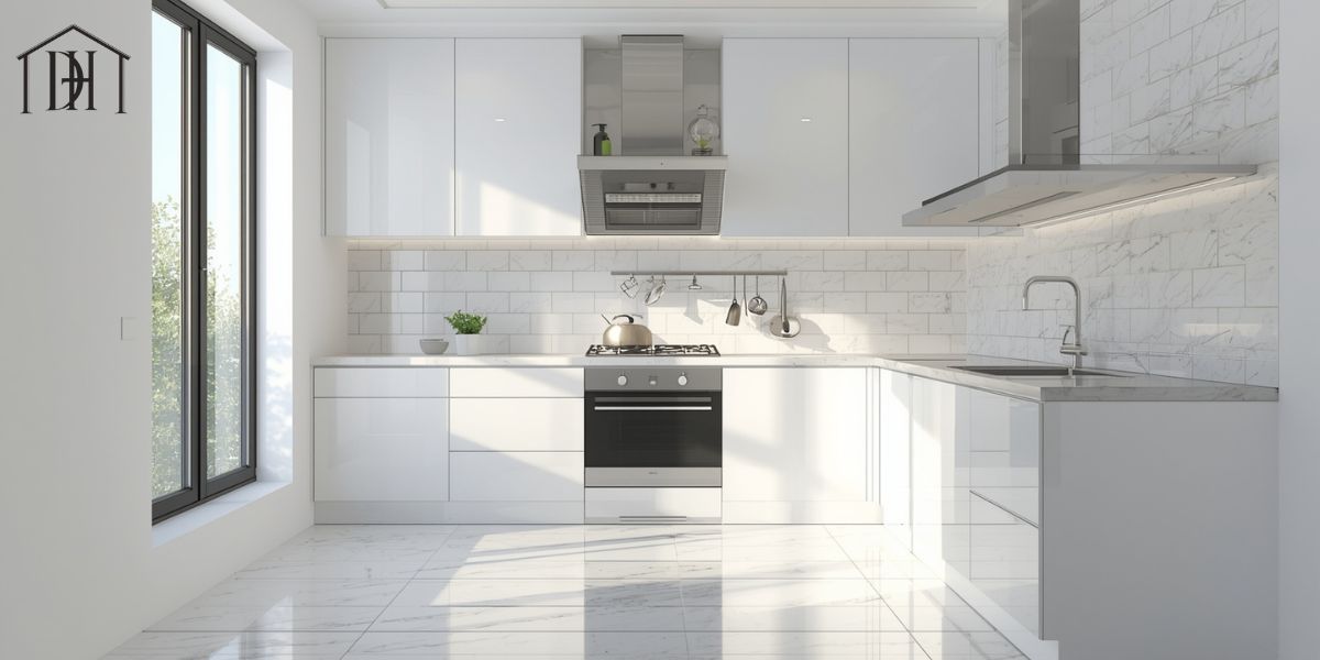
Choosing the best grout color for white tile goes beyond mere aesthetics; it fundamentally influences how your space feels and functions. When you select the grout that blends seamlessly, like white grout, the surface appears almost continuous and expansive, offering a clean, airy backdrop ideal for minimalist bathroom or kitchen design.
Conversely, opting for contrasting tones such as dark or charcoal grout can make the tile pattern pop, adding graphic impact and framing each tile with a bold edge. In U.S. homes where space and lighting vary widely, understanding how space perception and grout color interact becomes crucial for creating the right mood.
Moreover, tile and grout design tips often emphasize that grout aesthetics and functionality must align: lighter hues highlight grout lines easily and may require more cleaning, while darker tones may accentuate imperfections in the tile or layout. By treating your grout color as part of the design—rather than an afterthought—you set the stage for long-term satisfaction.
Top Grout Color Options for White Tile
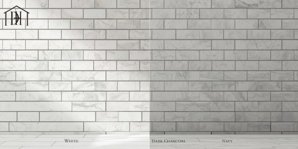
When determining the best grout color for white tile, you’ll want to assess the full spectrum of grout color options and how they pair with your tile type, installation pattern, and design goal. For example, light gray grout delivers a subtle contrast that defines each tile without overwhelming the space, and it often hides dirt better than its pure white counterpart. On the other hand, beige grout or tan grout with white tile brings warmth and soft definition, making them great for traditional interior design or farmhouse design settings.
For those wanting drama, colored grout such as navy or emerald can transform white tile into a statement wall, though this requires intentional design planning. A grout color chart from manufacturers shows dozens of hues—from “Arctic White” to “Charcoal” to “Steel Blue”—giving you a broad palette to consider.
Below is a quick comparison of five major options:
| Grout Color | Visual Impact | Practical Considerations |
| White grout | Seamless, airy, blends into the tile | Shows stains easily; higher tile grout maintenance needed |
| Light gray grout | Soft definition; modern, clean | May need careful matching to tile undertone |
| Dark/charcoal grout | High contrast; dramatic pattern emphasis | Highlights tile flaws; bold design risk |
| Beige/tan grout | Warm, subtle contrast; welcoming feel | Slightly higher upkeep than darker tones |
| Colored grout | Unique accent; design-forward choice | Risk of dating the space; may fade or stain |
Choosing the best Grout Color for white tile Different Settings
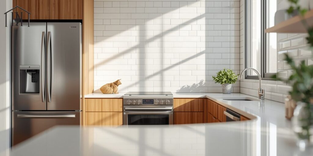
Determining the best grout color for white tile means tailoring your choice to the space and its use. In kitchens & backsplashes, for instance, you’ll face grease, spills and bright task lighting—so you might lean toward neutral or mid-tone grouts (e.g., light gray or beige) that balance aesthetics and durability. In bathrooms & showers, where moisture and mold are key concerns, it’s vital to consider waterproof grout for showers, sealing frequency and how easily dirt shows up—white on white tile might look pristine but demand frequent cleaning.
When white tile is placed in living rooms or bedrooms, the pattern becomes part of the decor rather than utility; depending on your interior design with white tile, you might choose grout for high-traffic areas that offers more forgiveness.
In every scenario you should also factor in grout line width: narrower joints call for smoother, lighter grout to maintain a continuous look; wider joints can carry darker grout without appearing busy. Experimentation via test swatches under real lighting is strongly recommended to confirm how the grout for kitchens or grout for bathrooms will age and live.
Matching Grout Color to Interior Aesthetics
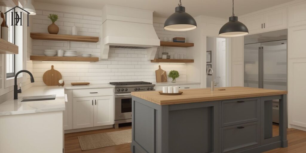
Aligning the best grout color for white tile with your design vocabulary transforms your tile work into a cohesive feature rather than an afterthought. In a modern farmhouse kitchen you might pair white subway tile with soft beige or tan grout to evoke a cozy, lived-in vibe while respecting crisp lines. Meanwhile, a minimalist bathroom design would lean toward white on white grout look or very light gray to not break the visual flow.
For traditional home decor, the emphasis is on warm, enduring tones—beige or mid-gray grout invites a sense of heritage rather than stark modernity. Even in a rustic kitchen backsplash, letting the grout complement natural wood tones or wrought iron hardware becomes part of your aesthetic grout selection strategy.
The key words here are harmony and intention: whether you aim for your grout to vanish or to contribute as grout as a design element, your choice signals how the room will feel.
Remember that contrasting grout emphasizes each tile, while matching keeps the surface unified. Use the grout contrast vs matching principle to decide whether your grout should fade away or make a statement.
Grout Color Ideas for Different Tile Types
Selecting the best grout color for white tile also means considering the tile’s type, finish and pattern. With a classic white subway tile, the tile pattern definition can either blend with matching grout or pop with contrast. For white marble tile grout, you might pick a soft gray or subtle beige to echo veining and create depth without distraction.
When you use textured or patterned white tiles, the amount of grout line visible increases—so the color becomes even more critical. For instance, large format white tiles have fewer grout lines, making bold contrasts less overwhelming, whereas mosaics or small tiles amplify the grout presence, requiring a more muted choice.
If your tile is glossy and reflective, lighter grouts maintain brightness; if matte or textured, you can lean toward mid-tones without losing cohesion. Testing via sample boards is especially useful here: the same grout can look vastly different beside porous stone versus smooth ceramic. Consider both modern tile patterns and their installation size when choosing between sanded vs unhanded grout, since the grout type affects color absorption and finish.
Current Grout Color Trends for 2025
As U.S. homeowners increasingly seek timeless yet fresh interiors, the landscape of what constitutes the best grout color for white tile is shifting. One prominent trend is neutral grout tones—soft greys, sandy beiges and off-whites that allow the tile and surrounding décor to shine without competing. Simultaneously, eco-friendly formulations of grout sealing are gaining traction: low-VOC or bio-based grouts support sustainable builds.
On the more daring side, we’re seeing daring bold revival in colored grout: navy blue, forest green or even terracotta used with crisp white tile in statement pieces. Simply following the mainstream won’t cut it if you want to stand out; this makes informed grout color combinations an advantage.
In 2025, the mantra for many designers is “quiet foundation, bold detail” which translates into selecting grout that supports the tile’s presence rather than overshadowing it. To stay ahead, you might flip the script and treat your grout line as a subtle accent rather than background filler.
Practical Tips for Choosing Grout Color
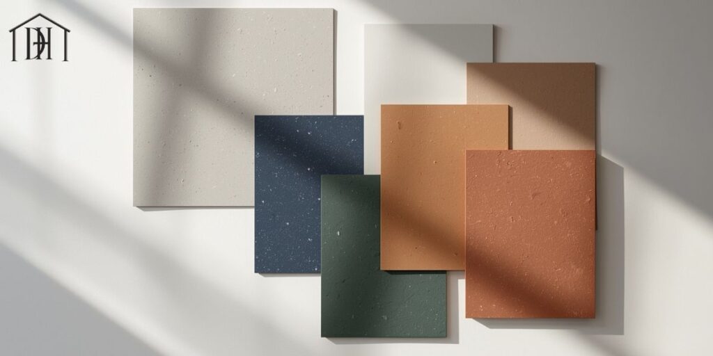
When choosing the best grout color for white tile, you should do more than pick a color swatch. First, gather multiple small samples and view them in your actual space—lighting changes everything. Use grout mock-up boards placed vertically and horizontally to see how shadows and reflections affect the tone. Consider the joint size and decide between sanded vs unsanded grout: sanded works for wider joints (1/8″ or more) but may show more texture; unsanded is better for narrow joints and delicate tile.
Don’t skip grout sealing tips: a good sealer prolongs color fidelity and helps with grout discoloration prevention. Also plan your grout cleaning and maintenance strategy: neutral mid-tones tend to hide dirt best in high-traffic or wet zones. Be sure you understand grout durability and how the finish interacts with your daily life.
These steps ensure your grout is not just pretty at install but remains resilient and integrated for years to come.
Common Mistakes to Avoid
Failing to treat the grout decision with the same care as the tile can undo your design in subtle ways. One common error is solely choosing by color swatch without seeing how the grout for white bathroom tiles or grout for kitchens appears in lighting over time—sunlight, artificial light and evening shadows change everything.
Another frequent mistake is ignoring how the joint width will affect appearance: too wide a grout line with contrasting color can dominate your layout instead of enhancing it. Neglecting sealing invites grout line width issues and discoloration, especially in wet or high-traffic areas. Finally, selecting a high-contrast look under the assumption it “looks bold” may actually date the space or reveal installation flaws—remember that visible grout also visualizes imperfections.
Avoid these mistakes and you’ll keep your white tile project looking intentional, not accidental.
Final Thoughts
In the quest for the best grout color for white tile, it’s clear that thoughtful selection pays off in both aesthetics and function. Whether you want your tile to vanish into the background or emerge as a patterned showpiece, your grout color directs the narrative.
The key lies in understanding your setting, confirming your color under real conditions, and aligning your selection with your overall design vision—from interior design with white tile to tile and grout maintenance plans. With attention to detail and mindful choices, your tile project will feel cohesive, polished and built to last.

